Horsicar : UX/UI project
Horsicar is a start-up who is an intermediate platform between particular for rented a vehicle for horse.
Anne-Sophie the founder of Horsicar wants to redesign the renter part of the website to improve the way to navigate in the website and would like to modernize her website, review the user journey, simplify the approach and convert more.
First, we have a first appointment to clarify her need and understand better the company, her vision, missions, values.
I explain to Anne-Sophie the process of Design Thinking with 5 steps : Empathize, Define, Ideate, Prototype, test. And we did the user flow and the user journey map together. She gives some keys about the market.
Market research
I did a benchmark about the market to identify some competitors like Renteo, Dadavroom, Galopro. The benchmark is use to compare the offer, the price, the positioning in the market and the target of all competitors.
Then I compare some features like map view, review, insurance and automatic booking. Horsicar has all this features so I decide to focus on UI and not on very new functionalities.
Then I did a mapping positioning where you can the actual position of Horsicar among the criteria (Innovative/ traditional, expansive/affordable). The goal after our work is that Horsicar became more innovative .
2. UX research
After we made a survey to understand better the user and his use of the website. We had some 30 answers. More women, aged by 25 years old, use the website 1 or 2 times a year to move her horse.
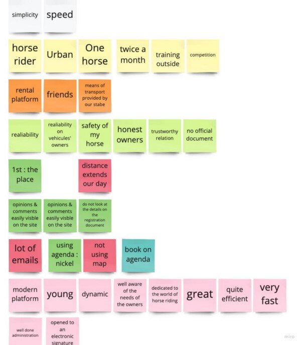
And I made some interviews to confirm the survey. And we analyse these interviews with the affinity map.
I sort the words of the interviewee by category. I found 8 categories and I regroup these categories in 4 big categories like “needs”, “ideal website” and “expectations”. Then I vote for solution I prefer work on it.
After, I did the persona. So this is Jumping Juliette.
Jumping Juliette is 25 years old, she is an HR officer and has a horse. She is passionate about horse-riding and sometimes have competitions. Juliette needs a solution to move her horse for competition every month and wants to schedule it in last minute, Juliette needs a vehicle nearby her stable to avoid losing time. She frustrated because she doesn’t want to waste her time looking for an owner in a long catalog.
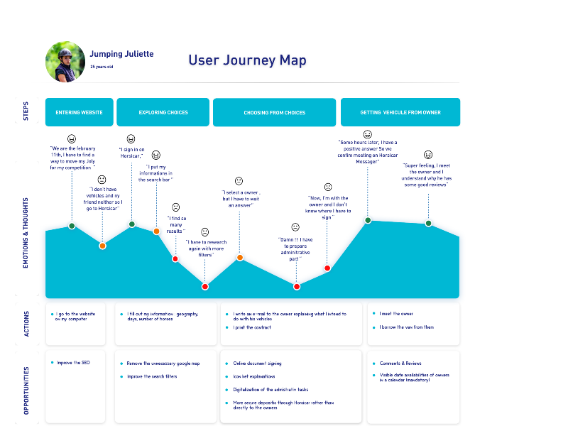
The user journey map is to reflet the current journey of the user and find some opportunities to improve her journey.
So, Juliette has a competition, she wants to move her horse, she is looking for a solution and come to Horsicar.com, she writes her criteria of searching but she found a too long catalog after she books a vehicle, she has to wait an answer from the owner and prepare administrative part. Finally, she is happy because she can rent a vehicle quickly and the owner as nice.
And the user flow, we didn’t change anything to the actual user flow because it is simple et fluid for customer. We focus on the UI and new functionality inside this user flow.
And I formulate some How might we to focus me problem of the user.
How might we help our users search more precisely through multiple, simultaneous filter options ?
How might we guide users to their ideal vehicle option as they are browsing the catalog ?
The Value proposition Canvas is to identify some pains and gains and solve them.
And we wrote some User Journey to determinate the features.
As a millennium passionate about horse riding :
I want to be able to create an account easily so that I can use it quickly.
I want to be able to use Horsicar in a responsive way so that I can use it even on my smartphone.
I want to be able to rate the owner so that I can share my experience to help the other users to choose an owner.
I want to be able to book a vehicle for the last time so that I can move my horse with more flexibility.
I want to be able to select the distance so that I feel free from the distance to extend my day.
I want to be able to digitize the contract so that I avoid paper and I respect the planet.
I want to be able to rent a vehicle from a particular so that I can save money.
The Moscow method is to prioritize features and focus on essentials.
3. Ideation
The site map is a part of the ideation. The site map give us an idea of the construction of the website.
Site map
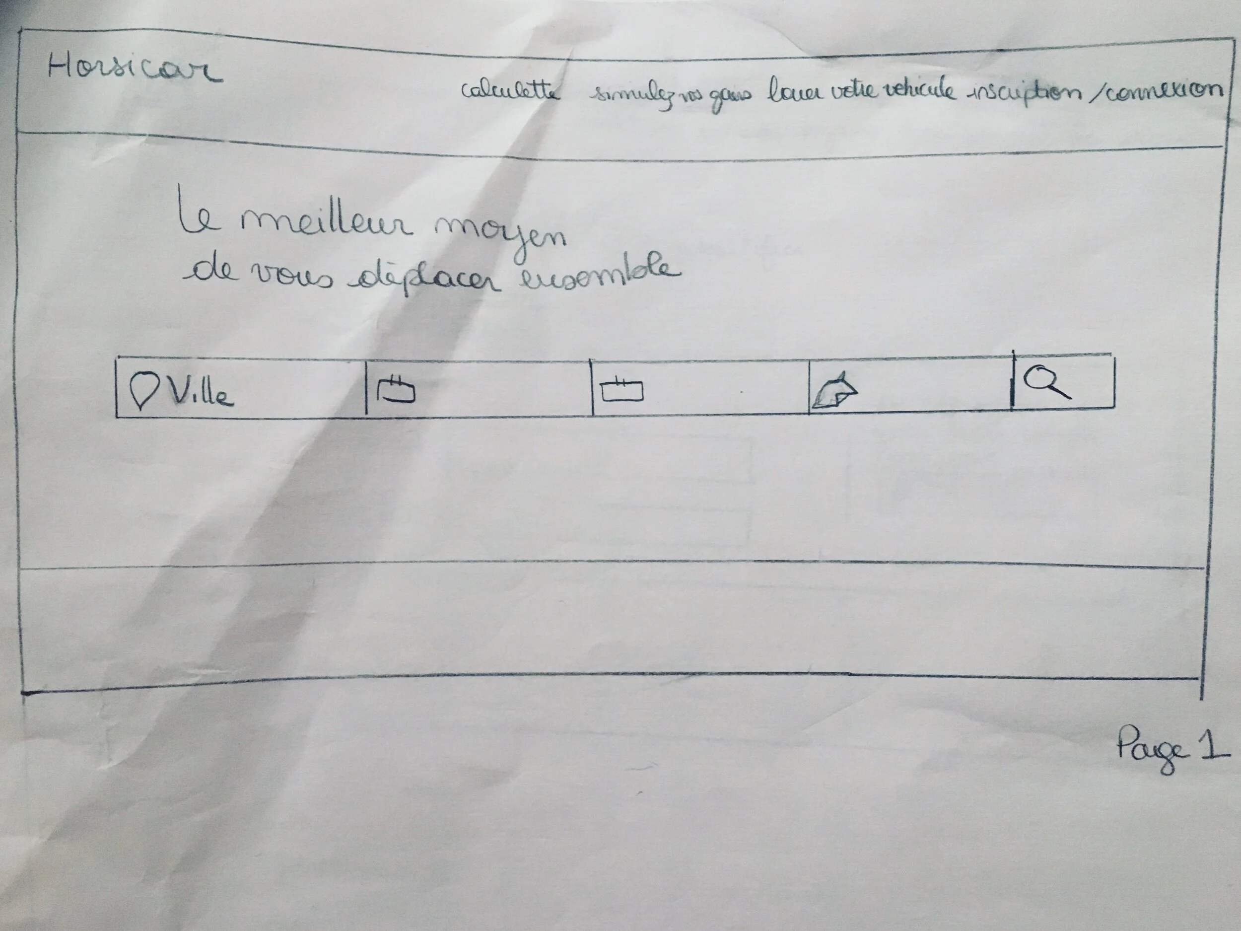
And I do some sketches.
Then the mid-fi was done in Figma.
Then, desirability testing, I have some feedbacks regarding the calendar, it wasn’t very intuitive, icons was not very clear, cards of pictures for owner & vehicles must be redefine. I have to add a page for the profil.
I have for the high-fi some sources of inspiration like Click and Boat, air bnb, and Blablacar.
Then I build the Style tile. I use the font “Brown” and 5 different colours.
style tile
After that, I build the high fidelity prototype.
https://www.figma.com/file/kJmkMxGe3Qu3EPtp92HvwE/Horsicar-Delivrables?node-id=242%3A1658
To conclude :
Importance of tools like Hotjar : in UI/UX it helps a lot
Importance of users
With the CRM we can made a survey and send it to all users
Next steps :
A/B testing
Mobile version
tutorial to take pictures like on vinted
Help / chatbot
Thank you!


